Home


Showing posts with label branding. Show all posts

Friday, 9 October 2009

Hertz is brought into the 21st century


(thanks to Brand New blog for the image)

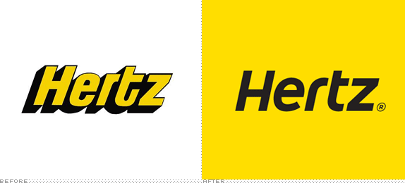
Car Hire company Hertz has brought in Landor brand consultancy to revamp its image, and with that comes a new logo. The Hertz logo has always stood out to me, and it's one which brings back memories of family holidays from years ago. I think it was the bold, wasp colouring and the heavy drop shadow which made it stick in my head. It has something about it which looks quite unique, to me. It might not be that pretty, but it is Hertz.

The new logo does away with the dated shadow, but sensibly keeps the yellow and black (or dark grey) colour pallete. The new typeface slots together nicely, as the old one did, but in a more modern and less mechanical way. Cleverly, they've also kept the italic slant of the lettering, which makes it much more "Hertzy" in feel.

Part of me is going to miss the old logo, but this rebrand has been done sensitively and I feel is probably not before time!

Thursday, 8 October 2009

Doctor Who Logo

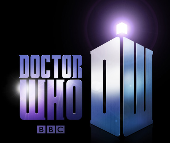
Shockingly (at least, for me), the BBC have just revealed that cult favourite Doctor Who is to get a new logo from 2010.

Before:


After:


Now I'm not a crazy Doctor Who fanatic, but I have watched much of the show since its return in 2005, and I have always been fond of the current, warm, organic looking logo. Although it has been criticised for looking slightly too delicate, I think it looks like a modern sci-fi logo should. Though it has always reminded me slightly of the Farscape one -


I'm not so keen on the new logo for a few reasons...

1. It lacks depth. The old logo looked as if it could have housed millions of galaxies within it, or as if it was alive, or on fire! The new one looks cold, bleak and metallic in comparison.

2. It looks too retro. I can't see kids (the show's main audience) taking to the new logo as much as its predecessor.

3. It looks messy. The tardis "DW" is not so bad on its own, but when put next to the Doctor Who slab serif text AND the BBC logo (which seems to have crept its way into the show's official logo), it's just too much. Hopefully the titles won't feature all of these elements together on the same screen.

4. Lens flares.

Perhaps it will grow on me, but on first impressions I'm not that impressed!

Tuesday, 6 October 2009

Electric Revolution

BBC Four have been running a new season of programmes celebrating the "Electric Revolution", which explores the way technology has changed the way we live over the years.

As part of this season, the channel has brought in some special idents. All of the idents begin with the regular BBC Four idents, before zooming out to reveal that they are playing on a piece of retro technology.


(thanks to TV Forum for the images - visit for videos)

I'm already an admirer of BBC Four's idents and presentation - I think they present a classy and understated feel for the channel, but these special versions are really nicely done. What a great way of promoting this special season of programmes, by incorporating the existing into some brilliantly set up scenes.

Wednesday, 30 September 2009

Brand loyalty = deadly habit


http://news.bbc.co.uk/1/hi/magazine/8282579.stm

A very interesting article regarding the idea of stripping cigarette packets of their branding in order to reduce the amount of smokers.

It seems there is a lot of evidence to suggest that giving all cigarette packets a uniform, bland and standardised look would help people to stop smoking, due to the fact that many smokers have become so attached to their brand and its associated image that part of their addiction, is in fact, an addiction to "brand"!

Shows the power that branding can have...

Monday, 28 September 2009

Cheeky Dixons


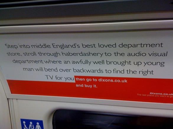
This new advertising campaign from online electricals retailer Dixons.co.uk caught my eye on the tube the other day.

At first glance, the poster looks a lot like an advert for John Lewis, emulating the department store's very recognisable typeface, colours and style. By the time you have read to the end of the poster, Dixons.co.uk has taken over.

It's a cleverly written poster, because this is the way many people end up purchasing electricals these days - checking out the product first in a store and then buying it for a much cheaper price online. It also never mentions any other brand name, but most people will be left in no doubt of the stores which it refers to. Though ironically the campaign demonstrates the power of the John Lewis branding - the Dixons branding in comparison looks weak!

The only downside of the campaign for Dixons is that some people might not realise that the store is now online only - Currys Digital was the brand which replaced all of Dixons' high street stores in 2007 (my Mum being one example of such a person!). In which case the advert seems to say that Dixons' staff are untrained and not "well brought up"!

Perhaps if more care was taken to build Dixons.co.uk as an online only brand when the rebranding took place, this new campaign would be more successful.

Retail Week article on the campaign

Thursday, 30 July 2009

Another fantastic Design blog...

Two great blogs in one day!! Design and Branding News is a brilliantly polished site which, basically does what it says on the tin, or as it says on its About page, "idsgn is a new blog about the things we see and enjoy (or sometimes hate) as designers."

Brand New

I've been following a great blog over the past few weeks, which gives news on rebranding exercises which companies and organisations around the world have undertaken. Each entry typically shows an image of the old company logo next to the new one for comparison.

I've always loved comparing old and new, so naturally this site really appeals to me. If you're anything like me, I warn you, you could spend hours on here!

The quality of rebrands ranges from fantastic to the downright wrong (see the Pizza Hut post), and the authors always give a fair and well-informed critique, which more often than not I agree with.


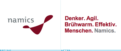
One of the most innovative rebrands featured on the site has been that of German web development and information technology company, Namics.

The new identity is ever-changing, preceding the company name with a series of words input by company employees via Twitter or SMS, and has been labeled “the world’s first ‘Real Time Corporate Identity".

Interesting stuff. Not speaking German I'm not sure what they all mean!

Check it out here and have a browse around the rest of the Brand New blog as well.

Sunday, 26 July 2009

I <3 Bovril


I love Bovril. And every since the unsightly Lidl store building in Redhill was demolished, a lovely old painted Bovril logo has been uncovered on the side of the adjacent building. Great reminder of the past. I love it when things like this are unearthed, having been lurking there all the time behind or underneath layers of other things.

Thursday, 2 July 2009

New look MTV


MTV has a fresh new look this week, courtesy of MTV creative directors and UK-based studio Universal Everything - which, incidentally has some great work on its fab site at universaleverything.com - well worth checking out.

I'm not so fond of the screen furniture which has been cooked up - as per usual there is far too much information on-screen at any one time. However I love the idents which have been lovingly created by Universal Everything. They really do show innovation and an engaging and unusual style of animation. It really does look shiny and brand new, which is what MTV were going for.


This one is my favourite, I think.

Take a look at the rest, on the Creative Review blog.

Wednesday, 1 July 2009

Take Five


Interesting Flickr set showing how the creative agency dixonbaxi's work for channel Five developed. Lots of "mood" boards. Very nicely done branding exercise - I really admire the outcome of the logo, especially the lovely animations which go with it.

http://www.flickr.com/photos/dixonbaxi/sets/72157607831049425/

Wednesday, 17 June 2009

BBC Two's identity crisis

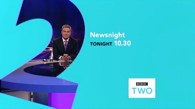
Disappointed that the BBC have gone and ruined what was a perfectly good channel branding package for BBC Two.

Today they went from this...


To this...


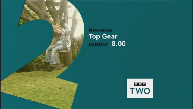
Why tilt the "2" at a strange angle? Why mix up the typography and colours horribly? And why on earth have they made the BBC logo black, whilst the TWO is teal?

Just...wrong.

Plus, they've done something very strange with the idents themselves.


Now instead of the logo fading in as the "2" comes into view, it is present from the very beginning and fades out as the "2" arrives. Why? Because the idents were designed and shot to have the logo at the bottom left (hence the "2" being off-centre). This results in looking very shoddy...


I think this shows that change for change's sake is hardly ever a good thing! If they wanted to refresh BBC Two's look, they should have gone for a complete overhaul, not tinker with what they already had. As it is, it looks like it's having an identity crisis.

As a final note, I think this screencap says it all...