Home


Showing posts with label TV presentation. Show all posts

Tuesday, 6 October 2009

Electric Revolution

BBC Four have been running a new season of programmes celebrating the "Electric Revolution", which explores the way technology has changed the way we live over the years.

As part of this season, the channel has brought in some special idents. All of the idents begin with the regular BBC Four idents, before zooming out to reveal that they are playing on a piece of retro technology.


(thanks to TV Forum for the images - visit for videos)

I'm already an admirer of BBC Four's idents and presentation - I think they present a classy and understated feel for the channel, but these special versions are really nicely done. What a great way of promoting this special season of programmes, by incorporating the existing into some brilliantly set up scenes.

Thursday, 10 September 2009

Ever stay for the closing credits?

There have been some fantastic and amazing closing credit sequences featured on various films for the past few years, but on TV the credits have generally remained pretty boring and staid. Not any more...

Specialists in TV title sequences Kiss My Pixel were clearly allowed to go crazy with TV chef - no - cook (he's a cook, not a chef!!), Nigel Slater's new BBC series.

Though unusually they seem to have gone more town on the closing credits than the opening titles (which aren't exactly anything special).


Check it out here (this link will take you straight to the closing sequence)

http://bbc.co.uk/i/mq461/?t=28m12s

They are credits which certainly make you sit up and take notice! They have even managed to sneakily get the Kiss My Pixel logo in there, masquerading as a type of herb!!

It's a nice idea, but I'm not keen on the way they have implemented it. The way the camera jolts suddenly from one jar to the next and blurs in between seems stilted and strange, as if we're looking through the eyes of a bleary-eyed student who's just got in from a night out, stumbling around the kitchen to rustle up a pre-bed omelette. It just doesn't seem right. I would have preferred a simple line of jars/cans/whatever on a shelf, with the camera slowly moving from one end to the other.

That said, it's certainly different and kudos to them for that.

http://www.kissmypixel.com/

BBC HD

I'm a big fan of the new BBC HD idents. They are shot beautifully and capture the essence of the BBC's high-def output brilliantly - bringing the viewer something spectacular.

The cover all the bases, too... Wildlife shows...


...Strictly Come Dancing...


...Crufts!


...Music (This one's a bit cheesy and I think the weakest of the set)


And fishing/wildlife/kids!


I'm especially fond of the way the idents resolve in a very neat and gentle way after the initial surprise and excitement.

Interestingly there's something rather European about the idents as well, but I can't quite put my finger on it.

Very nice. And a vast improvement on their previous CGI 1980's style effort! (which seems to have vanished from YouTube!)

Thursday, 2 July 2009

New look MTV


MTV has a fresh new look this week, courtesy of MTV creative directors and UK-based studio Universal Everything - which, incidentally has some great work on its fab site at universaleverything.com - well worth checking out.

I'm not so fond of the screen furniture which has been cooked up - as per usual there is far too much information on-screen at any one time. However I love the idents which have been lovingly created by Universal Everything. They really do show innovation and an engaging and unusual style of animation. It really does look shiny and brand new, which is what MTV were going for.


This one is my favourite, I think.

Take a look at the rest, on the Creative Review blog.

Wednesday, 1 July 2009

Take Five


Interesting Flickr set showing how the creative agency dixonbaxi's work for channel Five developed. Lots of "mood" boards. Very nicely done branding exercise - I really admire the outcome of the logo, especially the lovely animations which go with it.

http://www.flickr.com/photos/dixonbaxi/sets/72157607831049425/

Wednesday, 17 June 2009

BBC Two's identity crisis

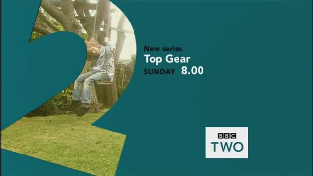
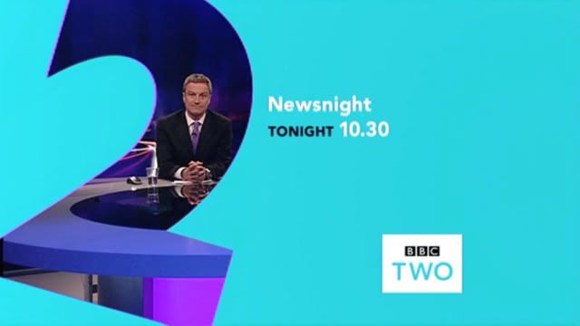
Disappointed that the BBC have gone and ruined what was a perfectly good channel branding package for BBC Two.

Today they went from this...


To this...


Why tilt the "2" at a strange angle? Why mix up the typography and colours horribly? And why on earth have they made the BBC logo black, whilst the TWO is teal?

Just...wrong.

Plus, they've done something very strange with the idents themselves.


Now instead of the logo fading in as the "2" comes into view, it is present from the very beginning and fades out as the "2" arrives. Why? Because the idents were designed and shot to have the logo at the bottom left (hence the "2" being off-centre). This results in looking very shoddy...


I think this shows that change for change's sake is hardly ever a good thing! If they wanted to refresh BBC Two's look, they should have gone for a complete overhaul, not tinker with what they already had. As it is, it looks like it's having an identity crisis.

As a final note, I think this screencap says it all...