
Two great blogs in one day!! Design and Branding News is a brilliantly polished site which, basically does what it says on the tin, or as it says on its About page, "idsgn is a new blog about the things we see and enjoy (or sometimes hate) as designers."
Showing posts with label graphic design. Show all posts
Showing posts with label graphic design. Show all posts
Thursday, 30 July 2009

Brand New
I've been following a great blog over the past few weeks, which gives news on rebranding exercises which companies and organisations around the world have undertaken. Each entry typically shows an image of the old company logo next to the new one for comparison.
I've always loved comparing old and new, so naturally this site really appeals to me. If you're anything like me, I warn you, you could spend hours on here!
The quality of rebrands ranges from fantastic to the downright wrong (see the Pizza Hut post), and the authors always give a fair and well-informed critique, which more often than not I agree with.

One of the most innovative rebrands featured on the site has been that of German web development and information technology company, Namics.
The new identity is ever-changing, preceding the company name with a series of words input by company employees via Twitter or SMS, and has been labeled “the world’s first ‘Real Time Corporate Identity".
Interesting stuff. Not speaking German I'm not sure what they all mean!
Check it out here and have a browse around the rest of the Brand New blog as well.
I've always loved comparing old and new, so naturally this site really appeals to me. If you're anything like me, I warn you, you could spend hours on here!
The quality of rebrands ranges from fantastic to the downright wrong (see the Pizza Hut post), and the authors always give a fair and well-informed critique, which more often than not I agree with.
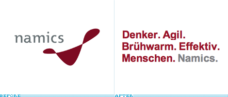
One of the most innovative rebrands featured on the site has been that of German web development and information technology company, Namics.
The new identity is ever-changing, preceding the company name with a series of words input by company employees via Twitter or SMS, and has been labeled “the world’s first ‘Real Time Corporate Identity".
Interesting stuff. Not speaking German I'm not sure what they all mean!
Check it out here and have a browse around the rest of the Brand New blog as well.
Thursday, 2 July 2009
New look MTV

MTV has a fresh new look this week, courtesy of MTV creative directors and UK-based studio Universal Everything - which, incidentally has some great work on its fab site at universaleverything.com - well worth checking out.
I'm not so fond of the screen furniture which has been cooked up - as per usual there is far too much information on-screen at any one time. However I love the idents which have been lovingly created by Universal Everything. They really do show innovation and an engaging and unusual style of animation. It really does look shiny and brand new, which is what MTV were going for.
This one is my favourite, I think.
Take a look at the rest, on the Creative Review blog.
Wednesday, 1 July 2009
Take Five

Interesting Flickr set showing how the creative agency dixonbaxi's work for channel Five developed. Lots of "mood" boards. Very nicely done branding exercise - I really admire the outcome of the logo, especially the lovely animations which go with it.
http://www.flickr.com/photos/dixonbaxi/sets/72157607831049425/
Wednesday, 17 June 2009
BBC Two's identity crisis
Disappointed that the BBC have gone and ruined what was a perfectly good channel branding package for BBC Two.
Today they went from this...

To this...

Why tilt the "2" at a strange angle? Why mix up the typography and colours horribly? And why on earth have they made the BBC logo black, whilst the TWO is teal?
Just...wrong.
Plus, they've done something very strange with the idents themselves.

Now instead of the logo fading in as the "2" comes into view, it is present from the very beginning and fades out as the "2" arrives. Why? Because the idents were designed and shot to have the logo at the bottom left (hence the "2" being off-centre). This results in looking very shoddy...

I think this shows that change for change's sake is hardly ever a good thing! If they wanted to refresh BBC Two's look, they should have gone for a complete overhaul, not tinker with what they already had. As it is, it looks like it's having an identity crisis.
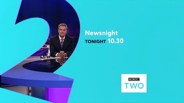
As a final note, I think this screencap says it all...

Today they went from this...

To this...
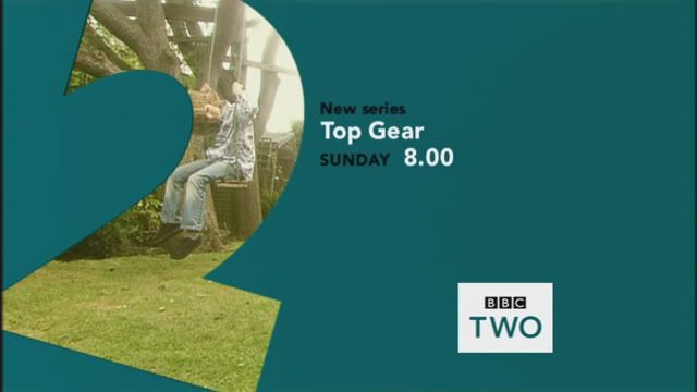
Why tilt the "2" at a strange angle? Why mix up the typography and colours horribly? And why on earth have they made the BBC logo black, whilst the TWO is teal?
Just...wrong.
Plus, they've done something very strange with the idents themselves.

Now instead of the logo fading in as the "2" comes into view, it is present from the very beginning and fades out as the "2" arrives. Why? Because the idents were designed and shot to have the logo at the bottom left (hence the "2" being off-centre). This results in looking very shoddy...

I think this shows that change for change's sake is hardly ever a good thing! If they wanted to refresh BBC Two's look, they should have gone for a complete overhaul, not tinker with what they already had. As it is, it looks like it's having an identity crisis.
As a final note, I think this screencap says it all...
Parklife Website

Hi everyone....welcome to my blog! Might take me a bit of time to get used to everything here...
This Aussie music festival website caught my attention for its sheer cool factor. It really is a joy to use. Loving the moving constellation background, and the lovely clean layout. Takes a bit of time to load the high bandwidth version but it's worth the wait!
Music's not bad either.
Click to check it out! Parklife Festival 2009
Subscribe to:
Posts (Atom)
