Home


Showing posts with label logo. Show all posts

Friday, 9 October 2009

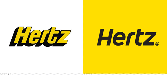
Hertz is brought into the 21st century


(thanks to Brand New blog for the image)

Car Hire company Hertz has brought in Landor brand consultancy to revamp its image, and with that comes a new logo. The Hertz logo has always stood out to me, and it's one which brings back memories of family holidays from years ago. I think it was the bold, wasp colouring and the heavy drop shadow which made it stick in my head. It has something about it which looks quite unique, to me. It might not be that pretty, but it is Hertz.

The new logo does away with the dated shadow, but sensibly keeps the yellow and black (or dark grey) colour pallete. The new typeface slots together nicely, as the old one did, but in a more modern and less mechanical way. Cleverly, they've also kept the italic slant of the lettering, which makes it much more "Hertzy" in feel.

Part of me is going to miss the old logo, but this rebrand has been done sensitively and I feel is probably not before time!

Thursday, 8 October 2009

Doctor Who Logo

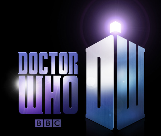
Shockingly (at least, for me), the BBC have just revealed that cult favourite Doctor Who is to get a new logo from 2010.

Before:


After:


Now I'm not a crazy Doctor Who fanatic, but I have watched much of the show since its return in 2005, and I have always been fond of the current, warm, organic looking logo. Although it has been criticised for looking slightly too delicate, I think it looks like a modern sci-fi logo should. Though it has always reminded me slightly of the Farscape one -


I'm not so keen on the new logo for a few reasons...

1. It lacks depth. The old logo looked as if it could have housed millions of galaxies within it, or as if it was alive, or on fire! The new one looks cold, bleak and metallic in comparison.

2. It looks too retro. I can't see kids (the show's main audience) taking to the new logo as much as its predecessor.

3. It looks messy. The tardis "DW" is not so bad on its own, but when put next to the Doctor Who slab serif text AND the BBC logo (which seems to have crept its way into the show's official logo), it's just too much. Hopefully the titles won't feature all of these elements together on the same screen.

4. Lens flares.

Perhaps it will grow on me, but on first impressions I'm not that impressed!

Sunday, 26 July 2009

I <3 Bovril


I love Bovril. And every since the unsightly Lidl store building in Redhill was demolished, a lovely old painted Bovril logo has been uncovered on the side of the adjacent building. Great reminder of the past. I love it when things like this are unearthed, having been lurking there all the time behind or underneath layers of other things.