Disappointed that the BBC have gone and ruined what was a perfectly good channel branding package for BBC Two.
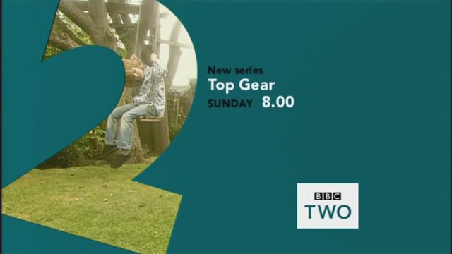
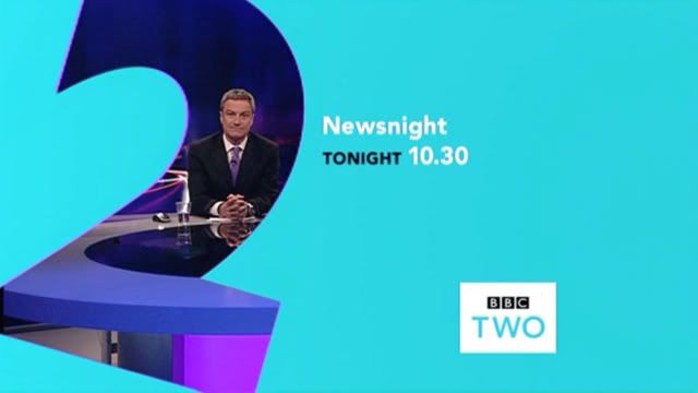
Today they went from this...

To this...

Why tilt the "2" at a strange angle? Why mix up the typography and colours horribly? And why on earth have they made the BBC logo black, whilst the TWO is teal?
Just...wrong.
Plus, they've done something very strange with the idents themselves.

Now instead of the logo fading in as the "2" comes into view, it is present from the very beginning and fades out as the "2" arrives. Why? Because the idents were designed and shot to have the logo at the bottom left (hence the "2" being off-centre). This results in looking very shoddy...

I think this shows that change for change's sake is hardly ever a good thing! If they wanted to refresh BBC Two's look, they should have gone for a complete overhaul, not tinker with what they already had. As it is, it looks like it's having an identity crisis.
As a final note, I think this screencap says it all...